Multi
Disciplinary
Designer
I design things you hold and things you scroll.
Shoes, bags, websites, identities
— and one building.
(About)

Products, brands, garments, and the sites that carry them — disciplines most keep separate, which is why the work holds together. I work with founders who know what good looks like and want it executed without being walked through it. Some start at zero. Others outgrew what once worked. Rigorous process. Enjoyable too — which shouldn't be rare.
II
Digital Design
SNEAKER 01
Statement
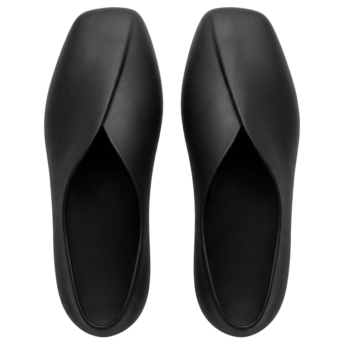
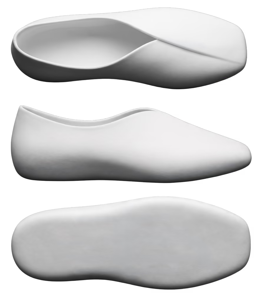
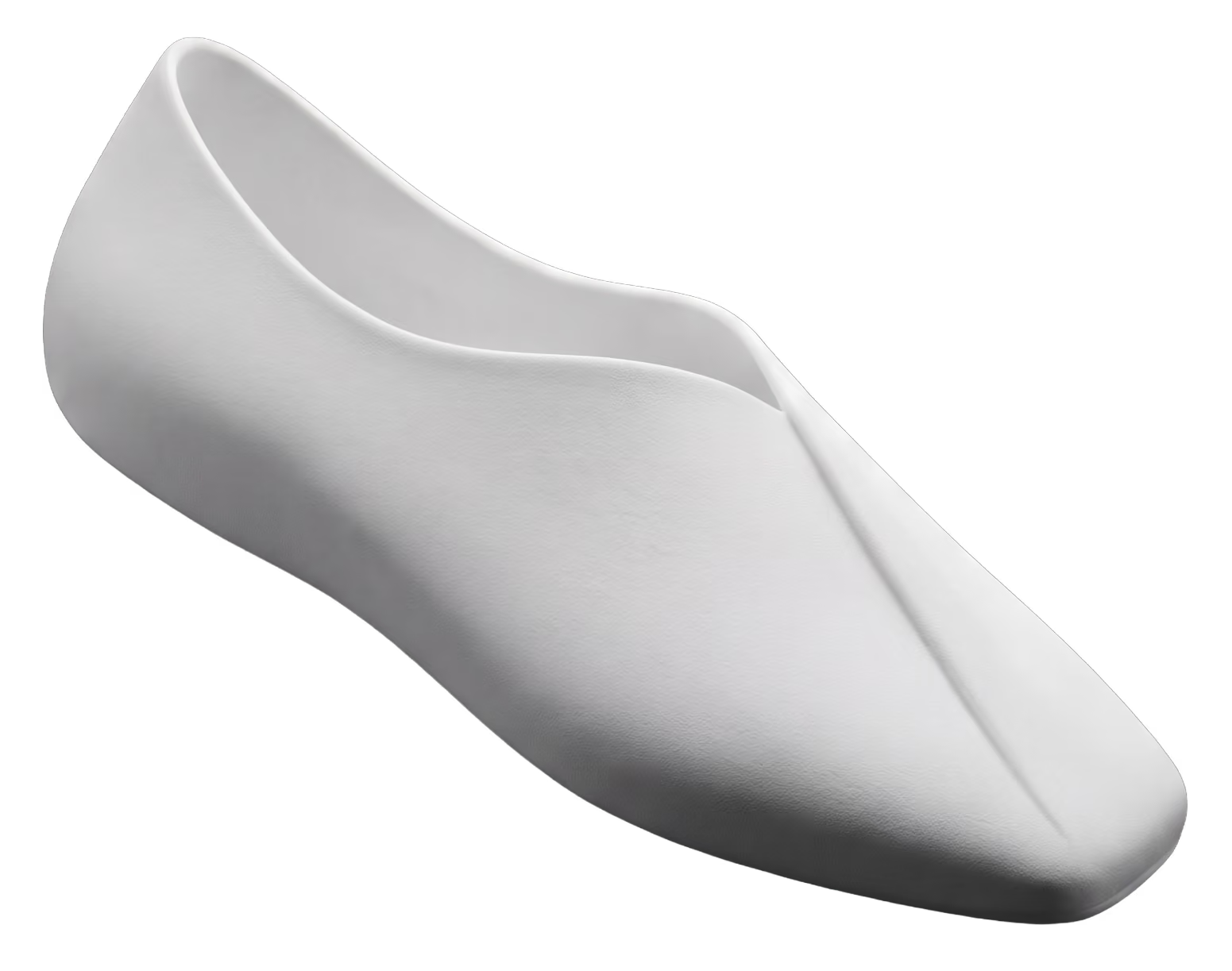
Reduction is the practice. The shoe only agrees.
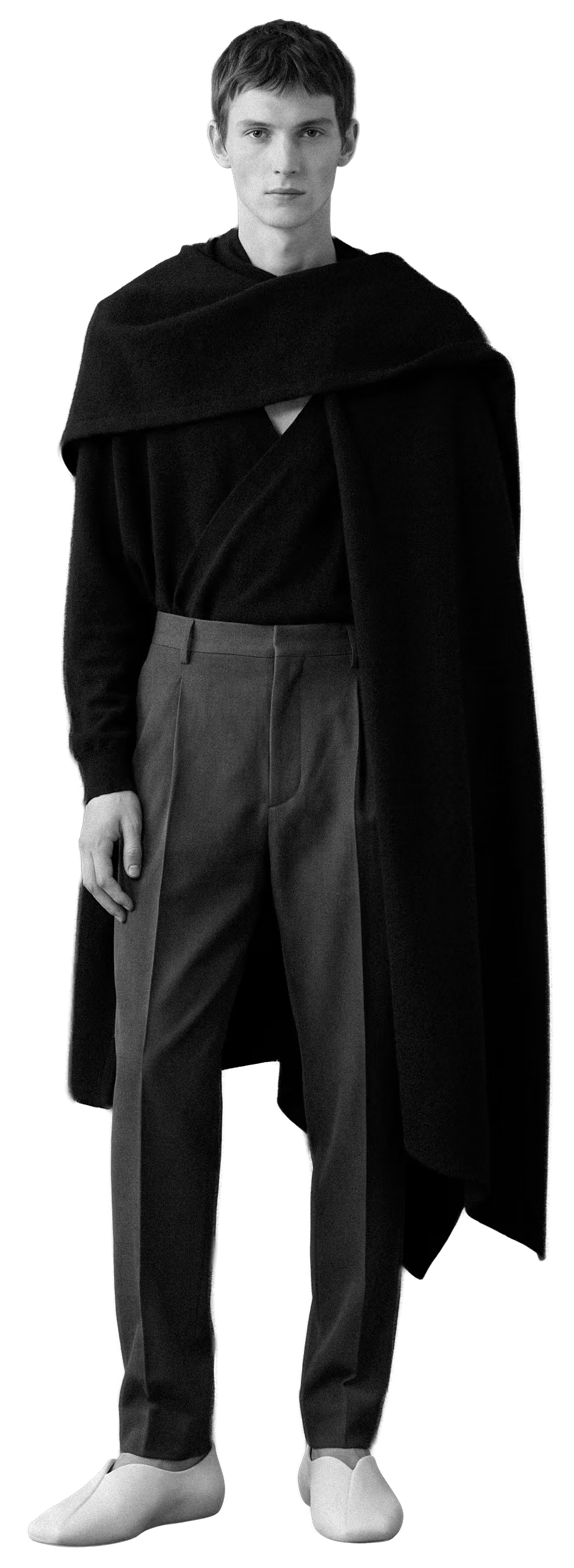
Pilates is a practice of taking things away — noise, tension, the extra movement standing in front of the one you meant. What is left is a clear body and a quiet head. Sneaker 01 is built on the same logic: one continuous form, no separation lines to interrupt it, nothing added that the eye has to resolve. The upper is two overlapping layers that wrap rather than fasten, so the foot is held the way the practice holds attention. It is made to be 3D printed with Zellerfeld — a single piece, no glue, no assembly.
Discipline
Footwear
Year
2026
Material
3D printed — Zellerfeld
Status
Concept — renders
Philosophy
Less, but better.
Dieter Rams framed it as less, but better — and the second half is the part most people skip. Taking things away is easy. Taking them away and having what remains feel finished is the difficult part, and it is the only part worth doing. Continuity does that work here. No panels, no seams, no hardware — a single surface reads as calm because there is nothing for the eye to negotiate. The two overlapping layers at the upper are the one gesture I kept, because wrapping says safe in a way a strap never will.
← BACK TO WORKInspiration
Continuity, borrowed from stillness.
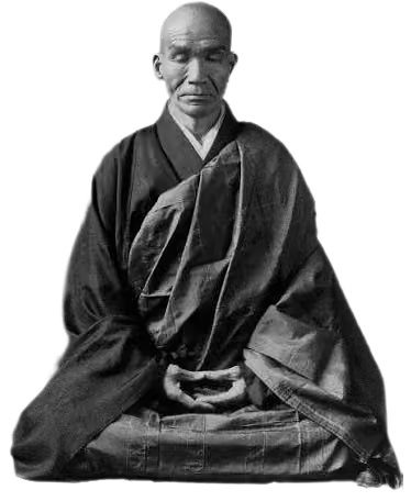
The references were mostly not footwear. They were conditions — a room with nothing left in it, a line that never breaks, the point in a session where the noise drops away and only the movement remains. Translating that meant refusing the things a shoe usually announces itself with: no panels, no stitch lines, no hardware, no logo doing the talking. The two overlapping layers at the upper arrived last and stayed, because wrapping reads as shelter in a way fastening never does. The foot is held rather than secured.

TOTE BAG 01
Statement
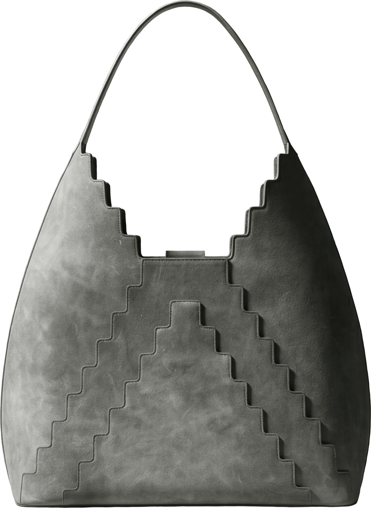
It takes its posture from a pyramid.
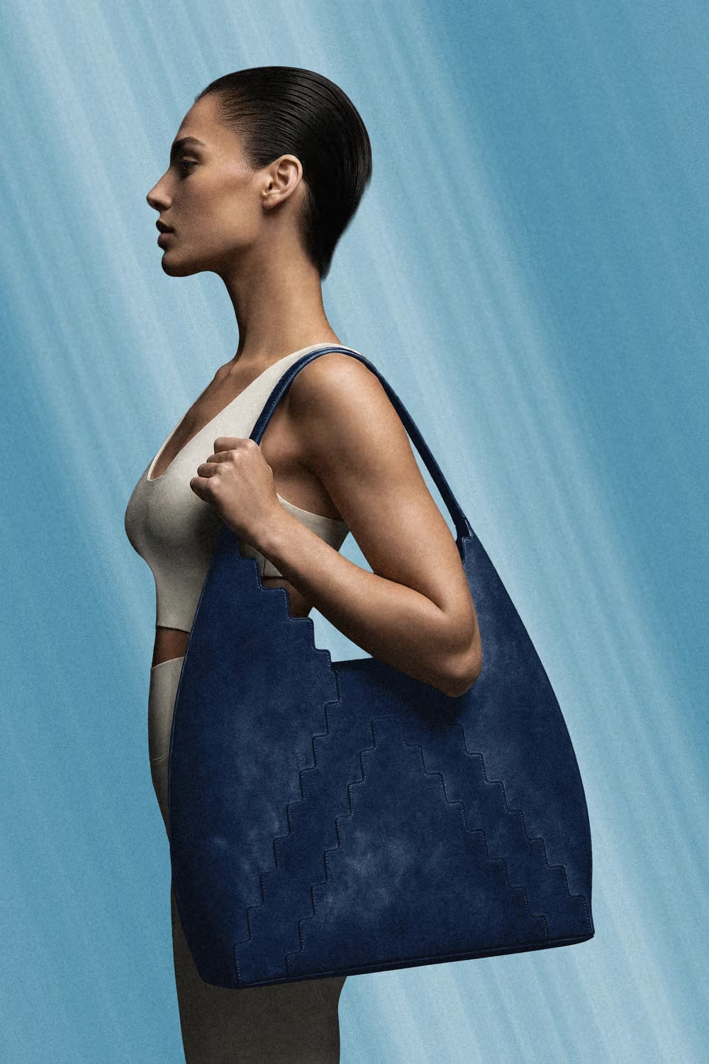
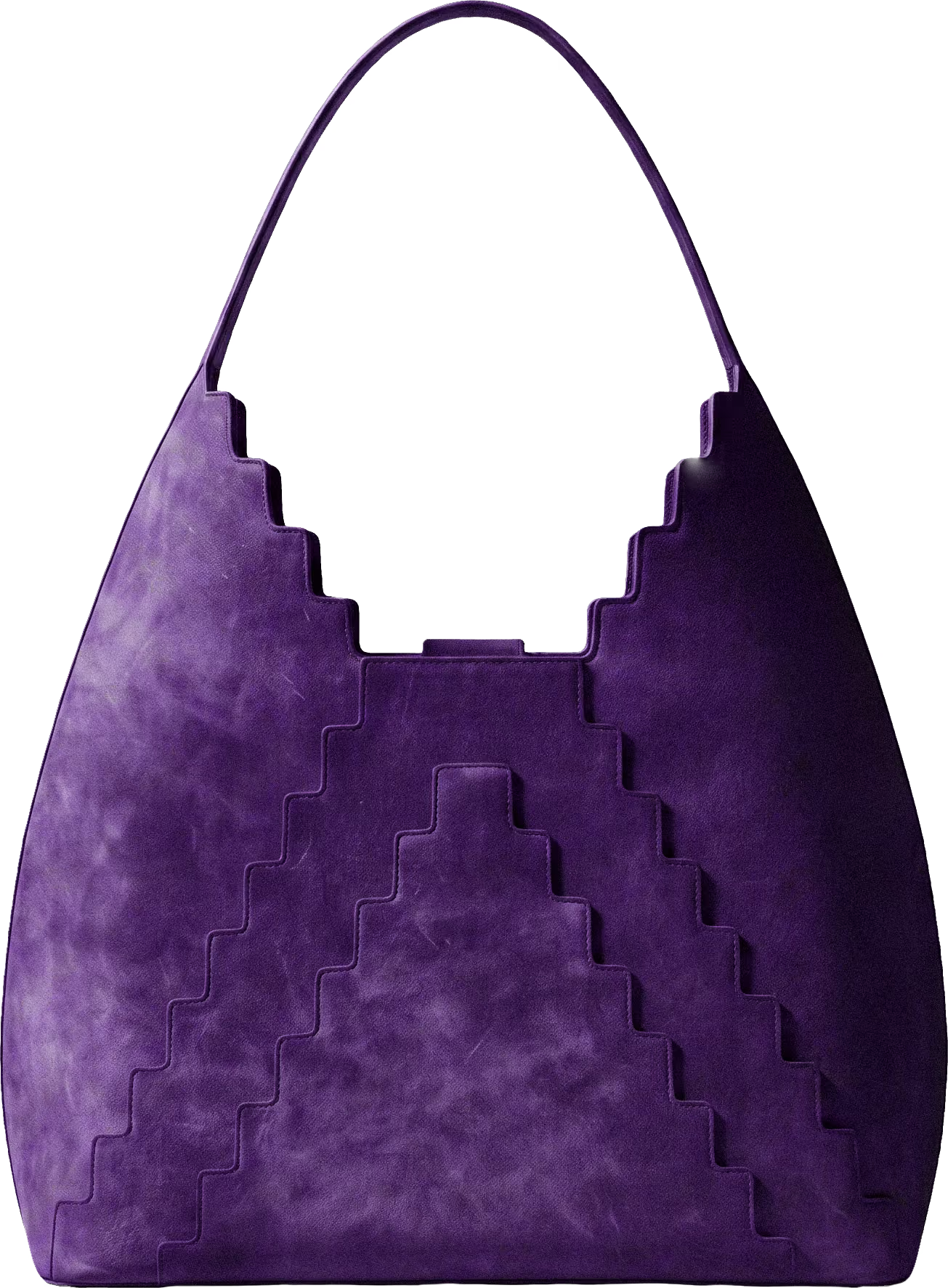
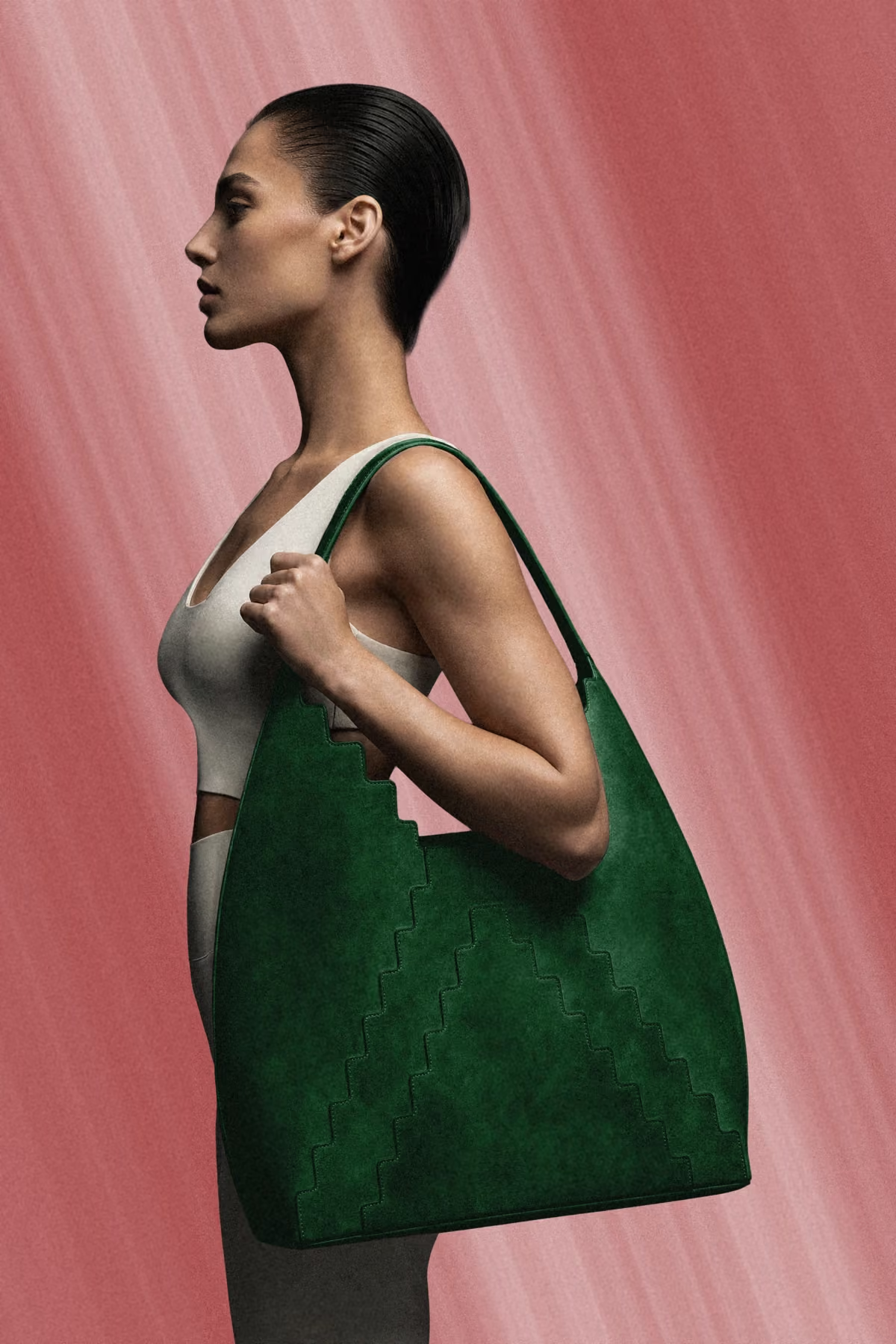
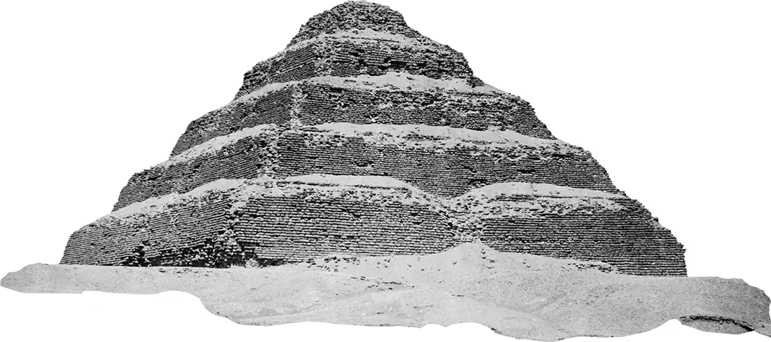
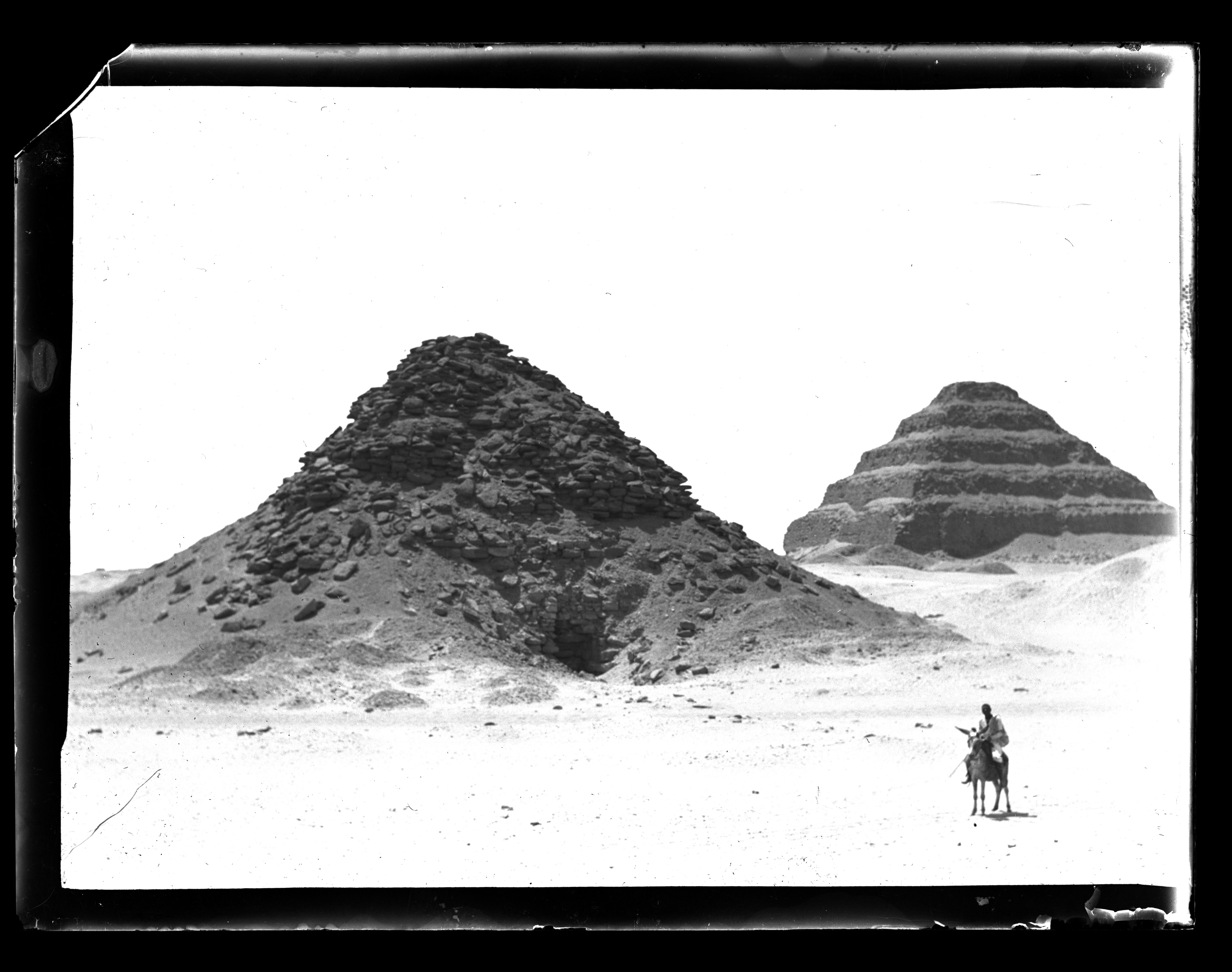
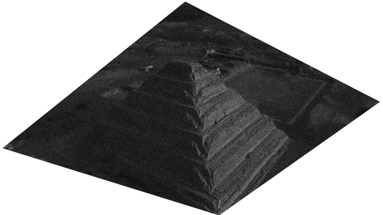
Wide at the base, narrowing as it rises, closing to a triangle at the handle. The proportion comes from the step pyramid of Djoser at Saqqara — a shape that reads as heavy and light at the same time, and has been standing long enough to prove the point. Here the taper is structural rather than decorative: the curve is cut so a sixteen inch laptop enters vertically, then rotates to lie along the long side. The handle drop matches the stepped drop of the opening exactly, so the handle folds down into the body and the bag stores flat without losing its structure.
Discipline
Accessories
Year
2026
Material
Textured half matte leather
Status
In production
Philosophy
One bag, or none at all.
I did not want a bag for occasions. This one goes to the studio, the shop, the lecture, the school run, and still holds whatever was left in it from yesterday. Designing for all of that at once is harder than designing for one thing well, because every decision has to survive more than one life. A reinforcement layer keeps the shape standing when it is empty. The leather is half matte so it does not perform newness. The geometry does the carrying, so nothing has to be bolted on to help it.
← BACK TO WORKInspiration
An old geometry, a modern load.
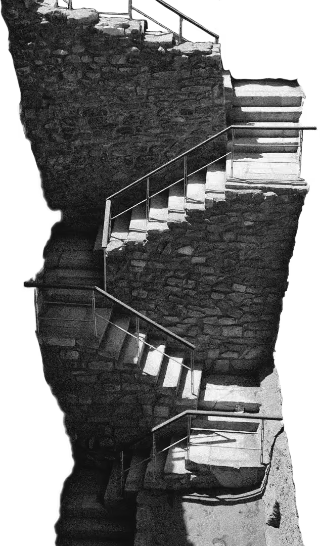
Djoser's step pyramid was the first monumental building made of cut stone, and it solved its problem the obvious way — widest where the load is greatest, narrowing as it climbs. Four and a half thousand years later that is still the honest answer to carrying weight. The bag inherits the logic rather than the ornament: mass low, taper upward, close to a point. Everything else came from the objects that actually go in it — a laptop, a change of clothes, groceries, whatever was already there.
HAND BAG 01
Statement
Ironwork, taken off the wall.
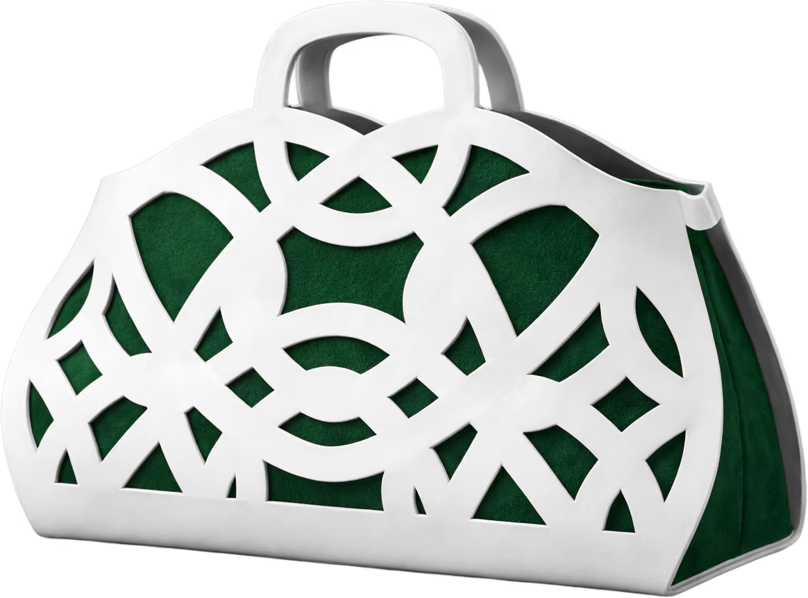
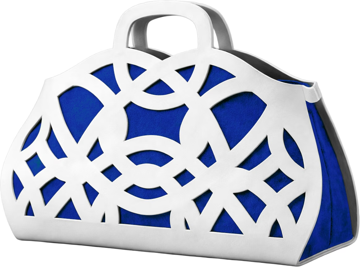
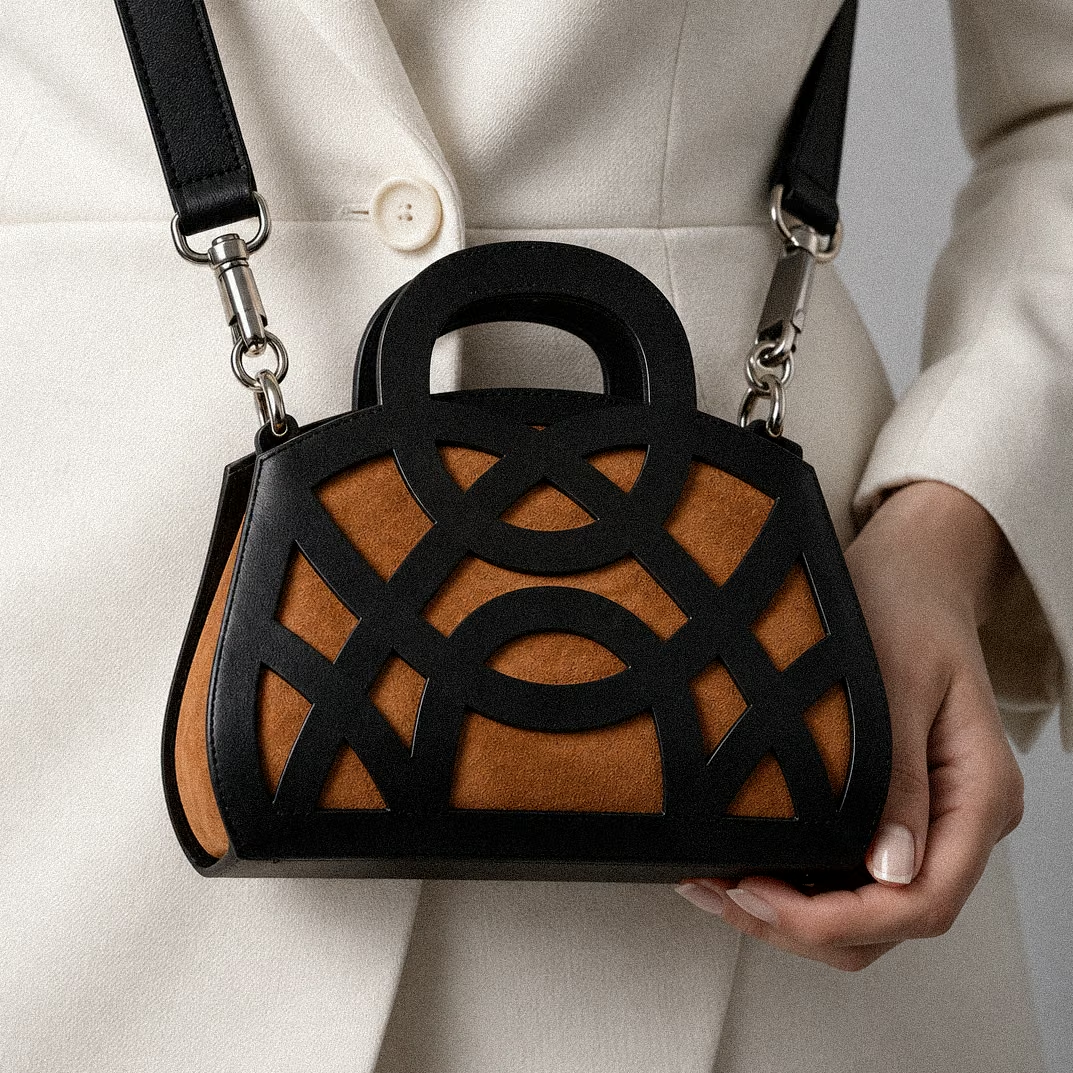
The pattern comes from a wrought-iron window grille — the kind where the curves close into flowers. Cast in resin, it keeps the ironwork's weight and its shadows. Suede sits behind the openings, so the colour you see is the lining, not the shell.
Discipline
Accessories
Year
2026
Material
Cast resin over suede
Colourways
White and blue, black and tan
Philosophy
The smallest object is the hardest brief.
Scale removes places to put a mistake. A large piece can absorb a weak decision somewhere in the middle; this cannot. That is exactly why it is worth making — it is the fastest way to find out whether an idea was ever any good.
← BACK TO WORKInspiration
Where this one started.
WOVEN BRIEF 01
Statement
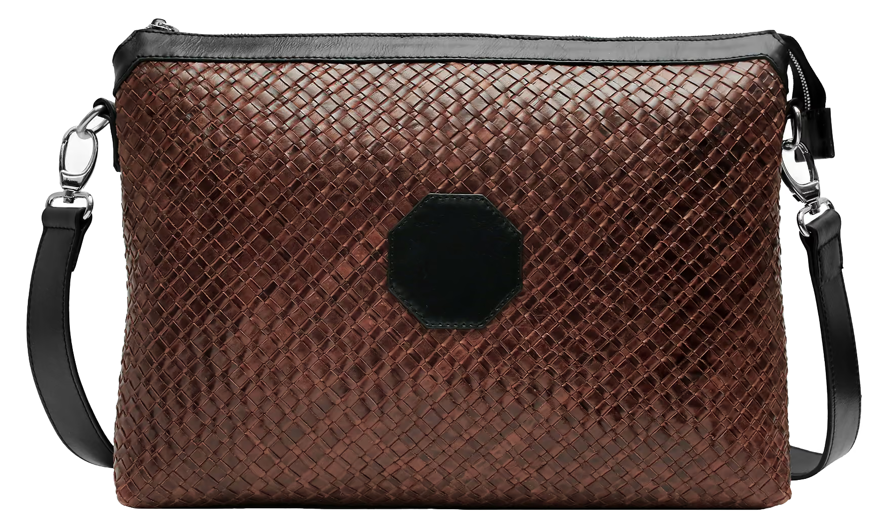
A brief drawn outward from the machine it has to carry.
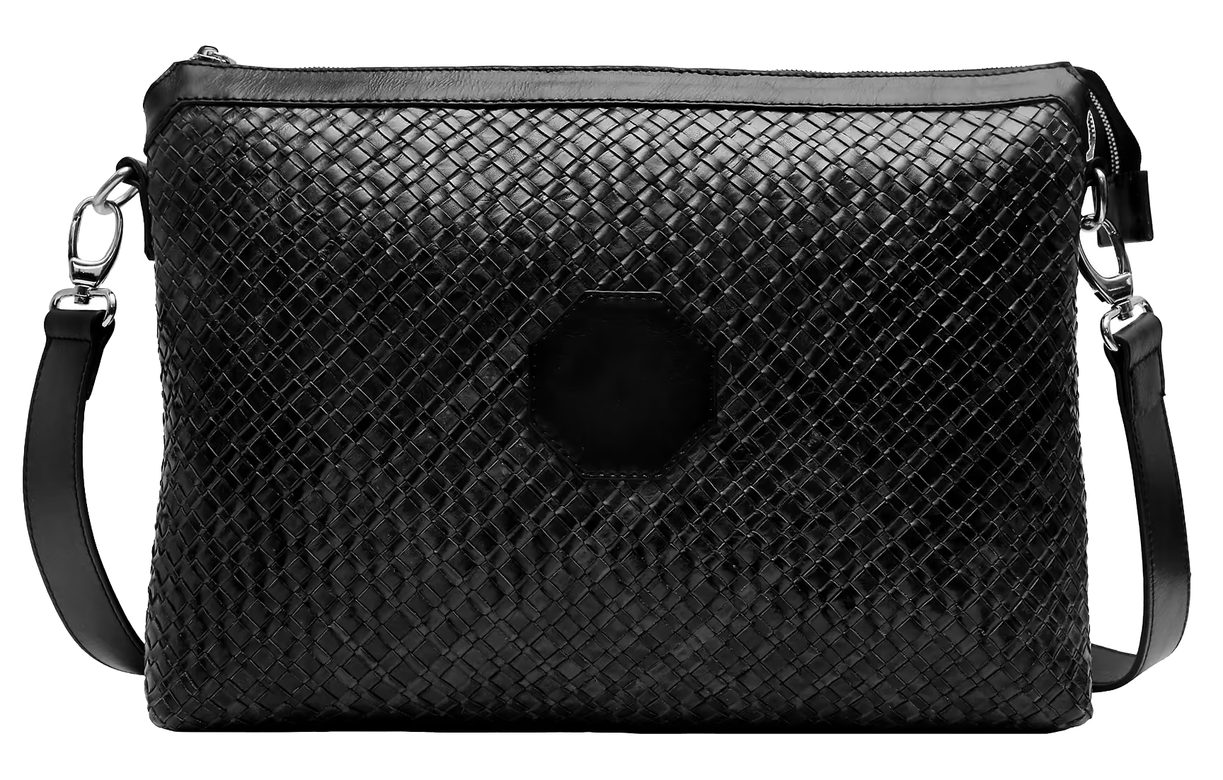
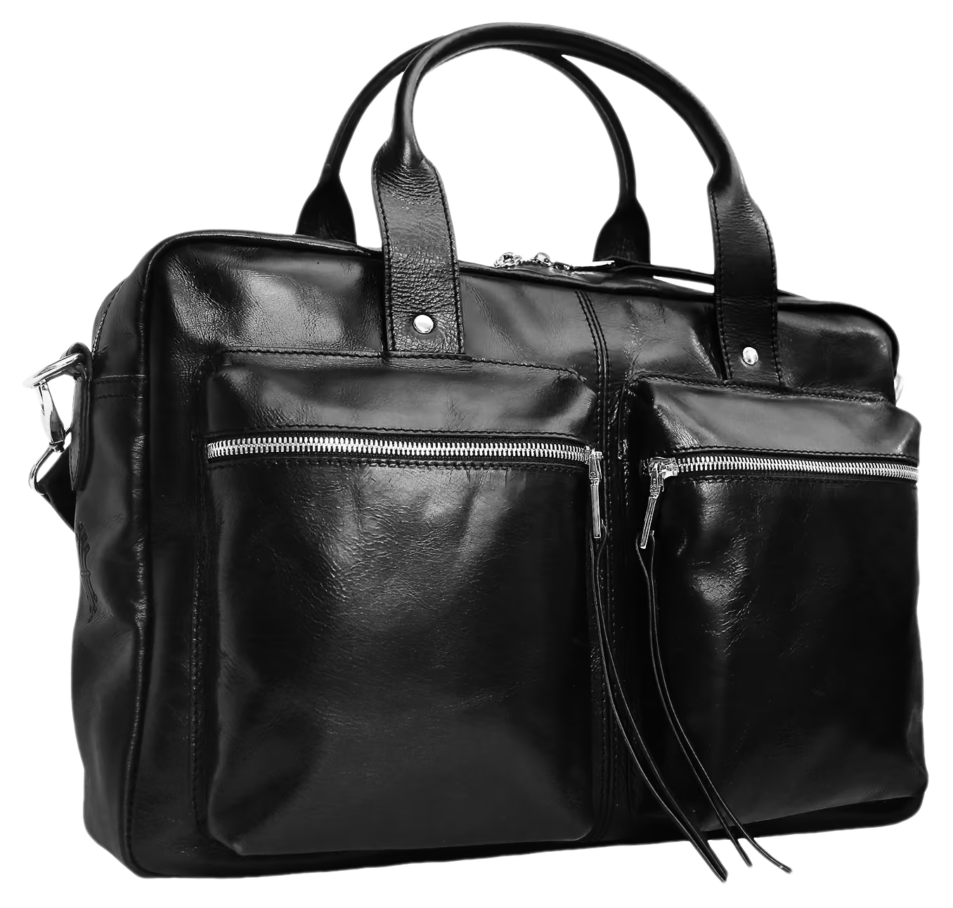
The interior was fixed before anything else — a sixteen inch laptop, and the clearance it needs to go in and come out without a fight. That rectangle set the depth, the height and the line of the opening. Every other decision was made outward from it rather than inward from a silhouette. Most bags are drawn as a shape and then asked to accommodate. This one runs the other way, which is why it is the proportion it is.
Type
Brief
Material
Machine-woven leather
Carries
16in laptop
Colourways
Black, burgundy
Philosophy
A weave that wanders reads as craft. A weave that holds reads as construction.
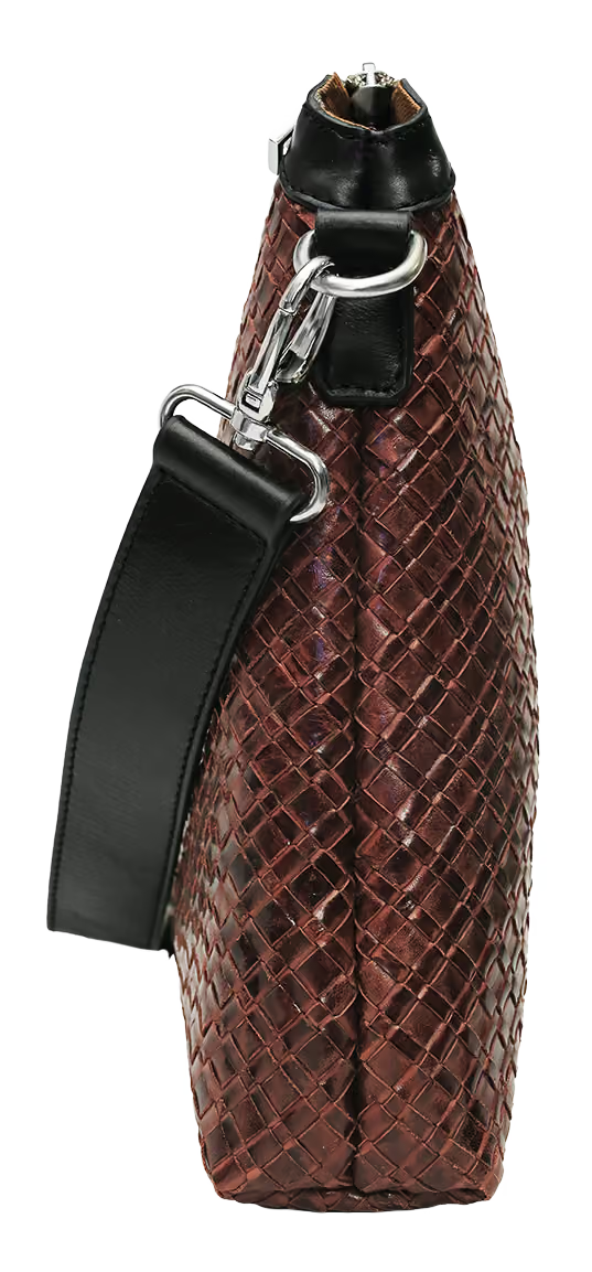
The leather is machine-woven: one cell size, even tension, the same across the whole panel. Hand weaving drifts, and that drift is usually sold as character. Here the consistency is the argument — a regular grid over a rectangle sized to a specific object, so the surface agrees with the structure instead of decorating it. At a distance you read a plain black panel. Up close it resolves into a grid. Nothing was added to make that happen.
MESSENGER 01
Statement
One pattern, two leathers, and everything the colour changes.
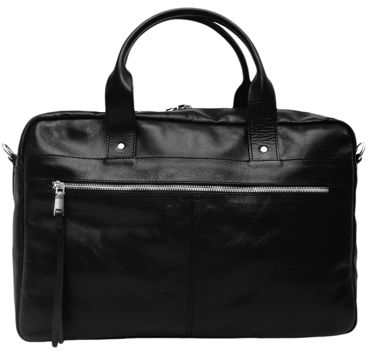
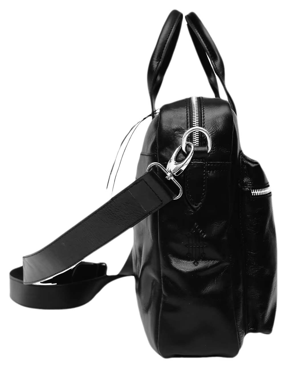
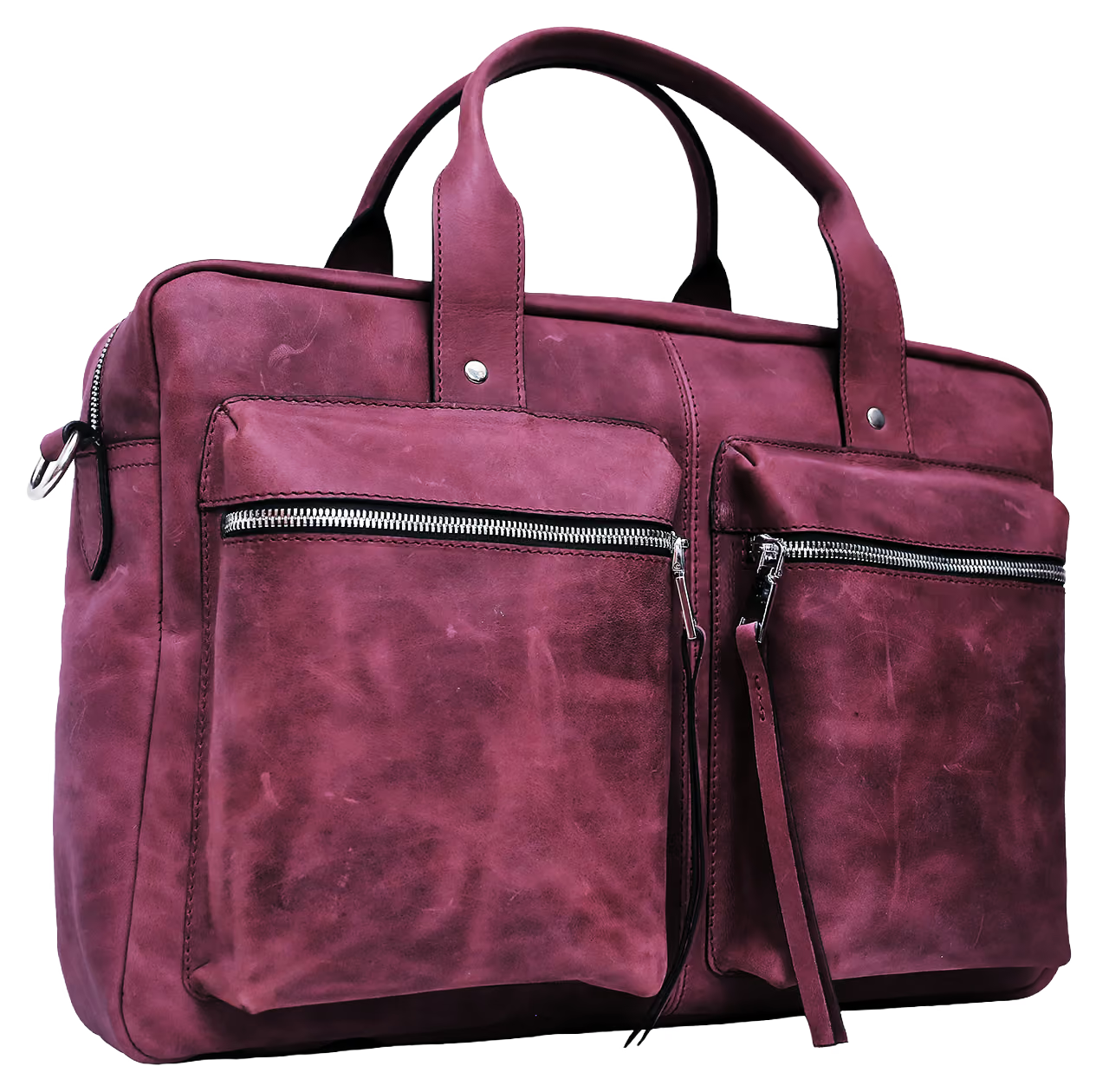
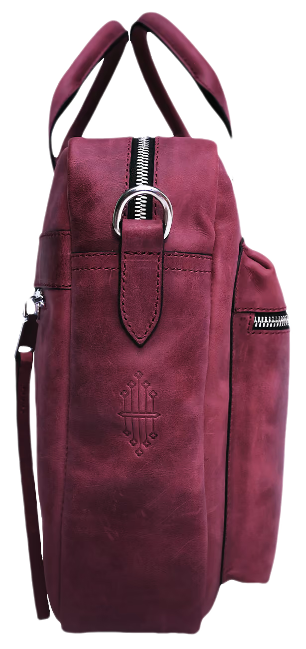
The black and the burgundy are the same bag. Identical panels, identical hardware, identical stitch line, identical twin pockets across the front. Nothing was redrawn between them. What changes is what you end up looking at. In black the eye goes to the outline and the metal — the silhouette does the talking and the surface stays quiet. In burgundy the grain comes forward, the light catches unevenly across the hide, and the same shape reads softer and older than it is.
Type
Messenger
Material
Leather
Carry
Top handle and shoulder strap
Colourways
Black, burgundy
Philosophy
Colour is not a variant. It is a different object.
Colourways are usually treated as a menu — pick the one you like, the bag is the same. It is not. A pattern that works in black can fail in a hide with visible grain, because black hides seams and burgundy shows them. Running the same construction in both is a test: if the second colour needed a change, the first one was hiding something. Nothing changed here, which is the only claim this window is making.
HATEM.IS
Statement
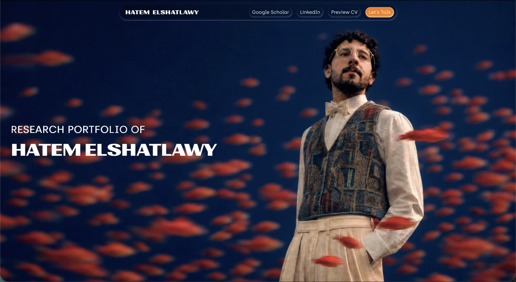
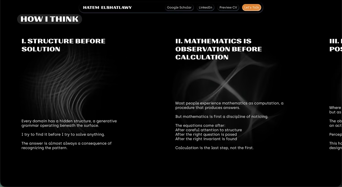
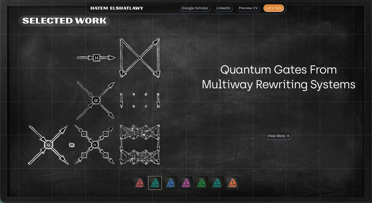
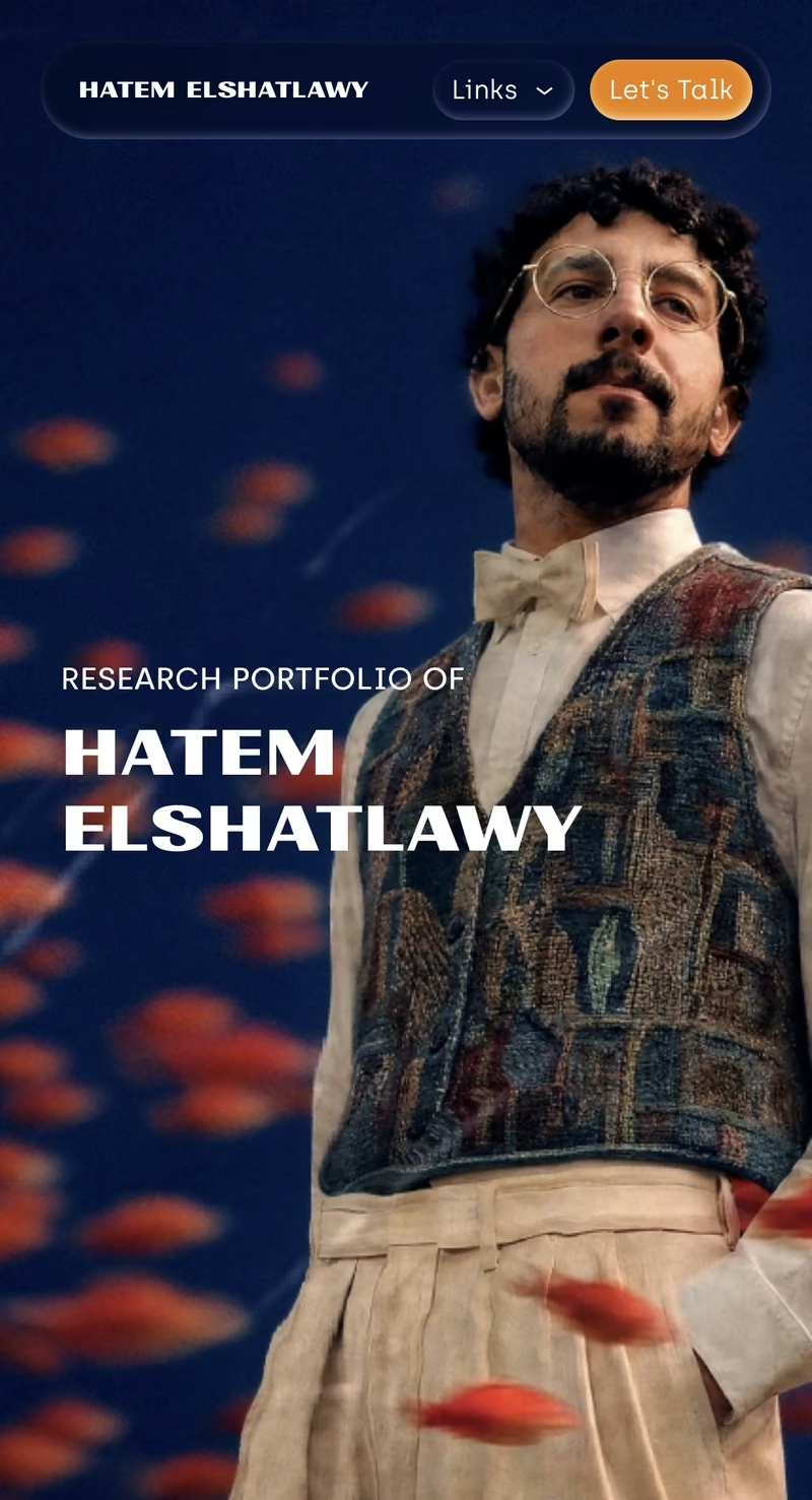
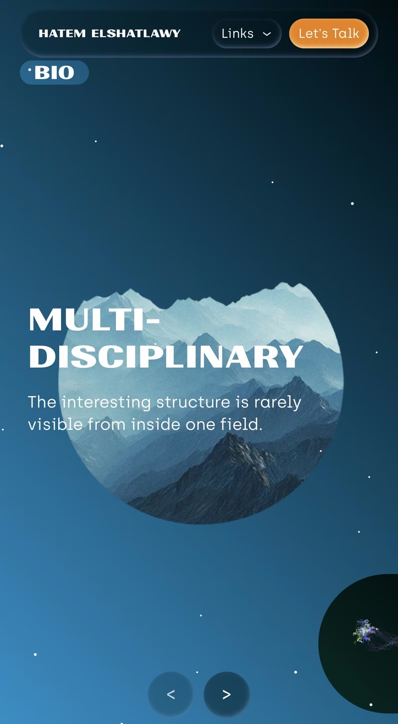
A portfolio built on its subject's own thesis: find the structure before you solve anything.
A physicist working on multicomputation, observer theory and metamathematics needed a portfolio. The default for that brief is a CV — a list, chronological, institution first. It answers where he has been, which is the least interesting question about him. His own argument is that every domain has a hidden grammar, and that recognising it comes before solving anything. So the site was built to obey that claim rather than describe it.
VISIT HATEM.IS ↗Client
Hatem Elshatlawy
Role
Concept, art direction, design, build
Scope
Research portfolio — home and CV
Year
2026
Live
Philosophy
Systems repeat. Scales change. Grammar persists.
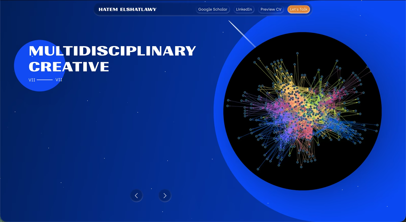
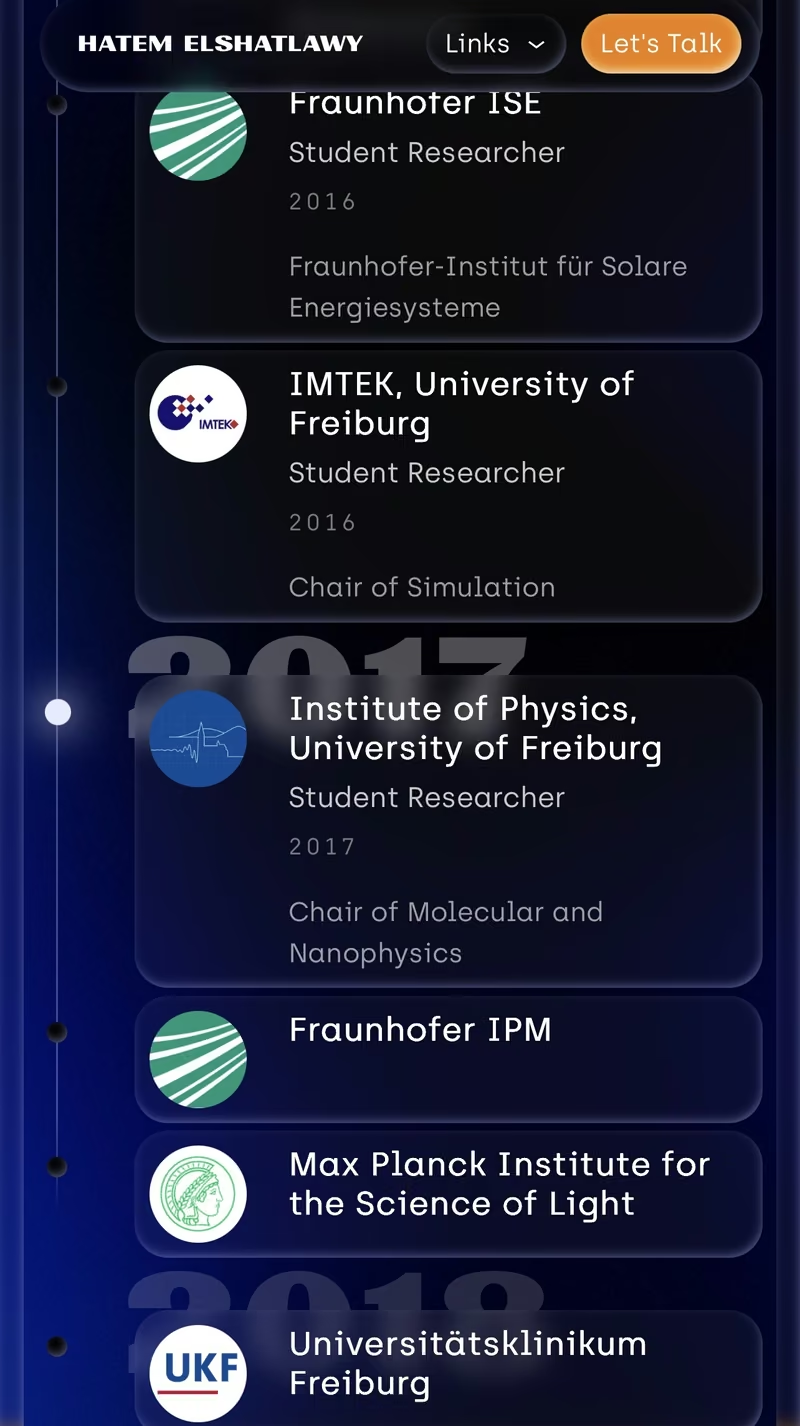
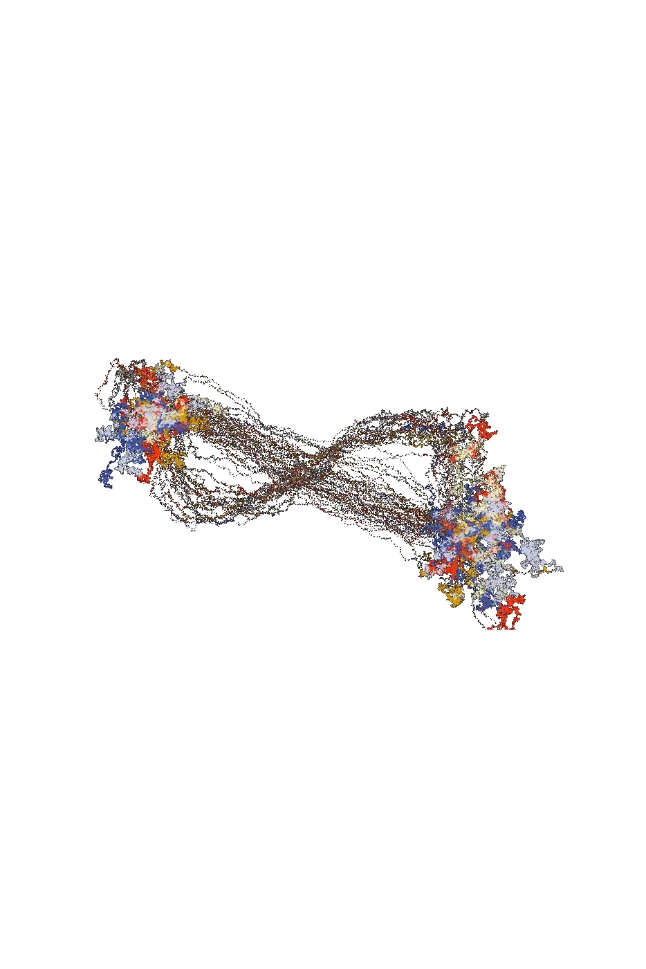
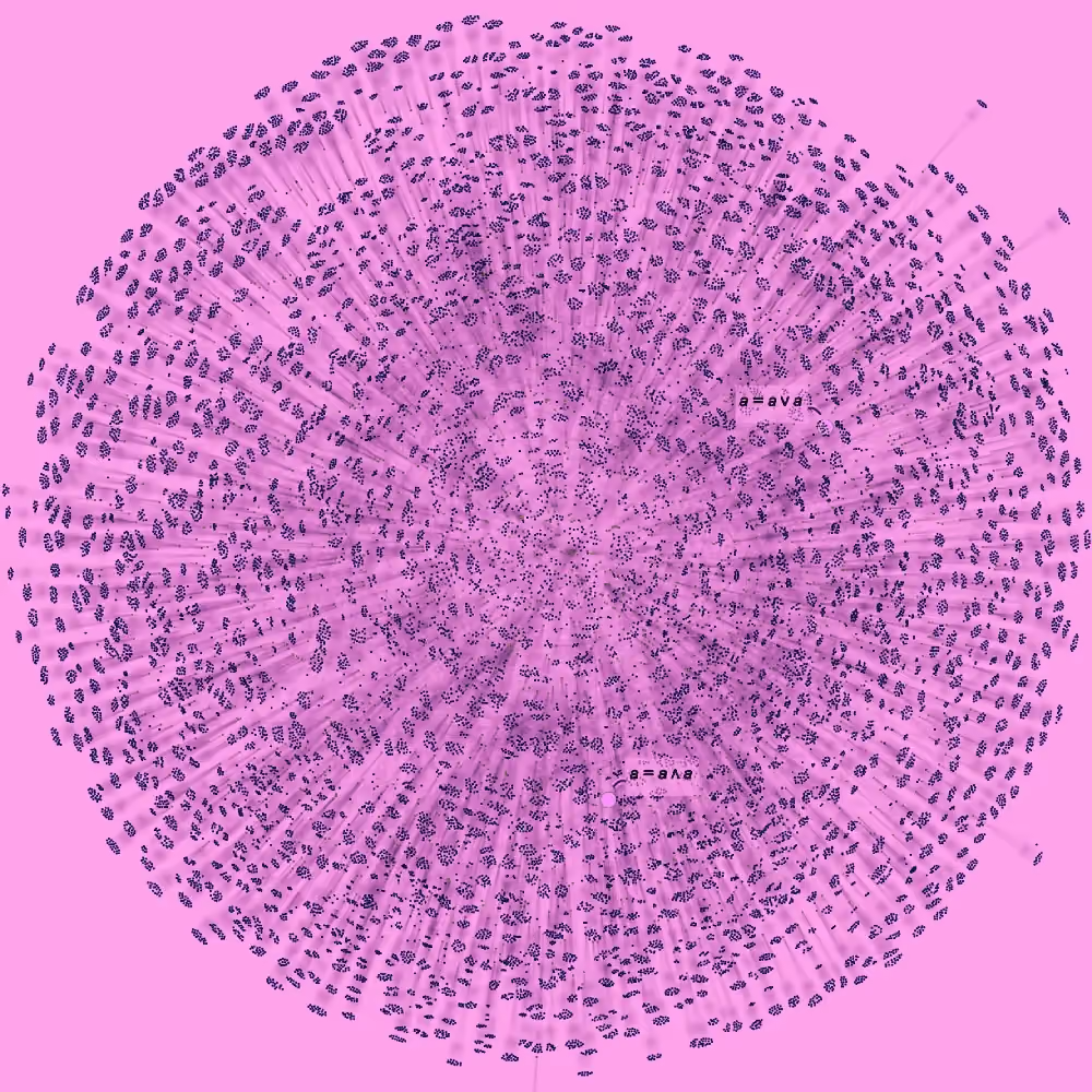
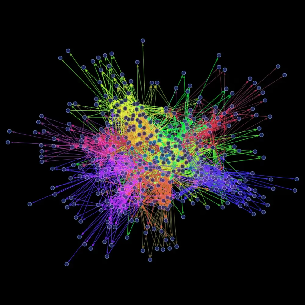
One gesture repeats at three scales. The roman numeral indexes the seven principles, counts the disciplines in the carousel, and runs as the spine of the page. Same mark, three sizes — the claim itself, made in a form you can see rather than read. Restraint did the rest: black, white, one blue, and a single orange used exactly once, on the only button that asks for something. Nothing decorative survived that wasn't structural. The CV page is where it holds hardest. That is the one page where a chronology is expected, and the one page that isn't one. The route so far — a line you travel, years dropped behind the institutions as ghosted numerals rather than ranked in front of them.
Inspiration
Things that keep their shape at every zoom.
The references weren't other portfolios. They were the objects his own field studies — the Mandelbrot set, protein folding, structures that hold their grammar however far you zoom in. Self-similarity was the brief and the method at the same time: build something whose smallest part carries the same rule as the whole.


LOXORD
Statement
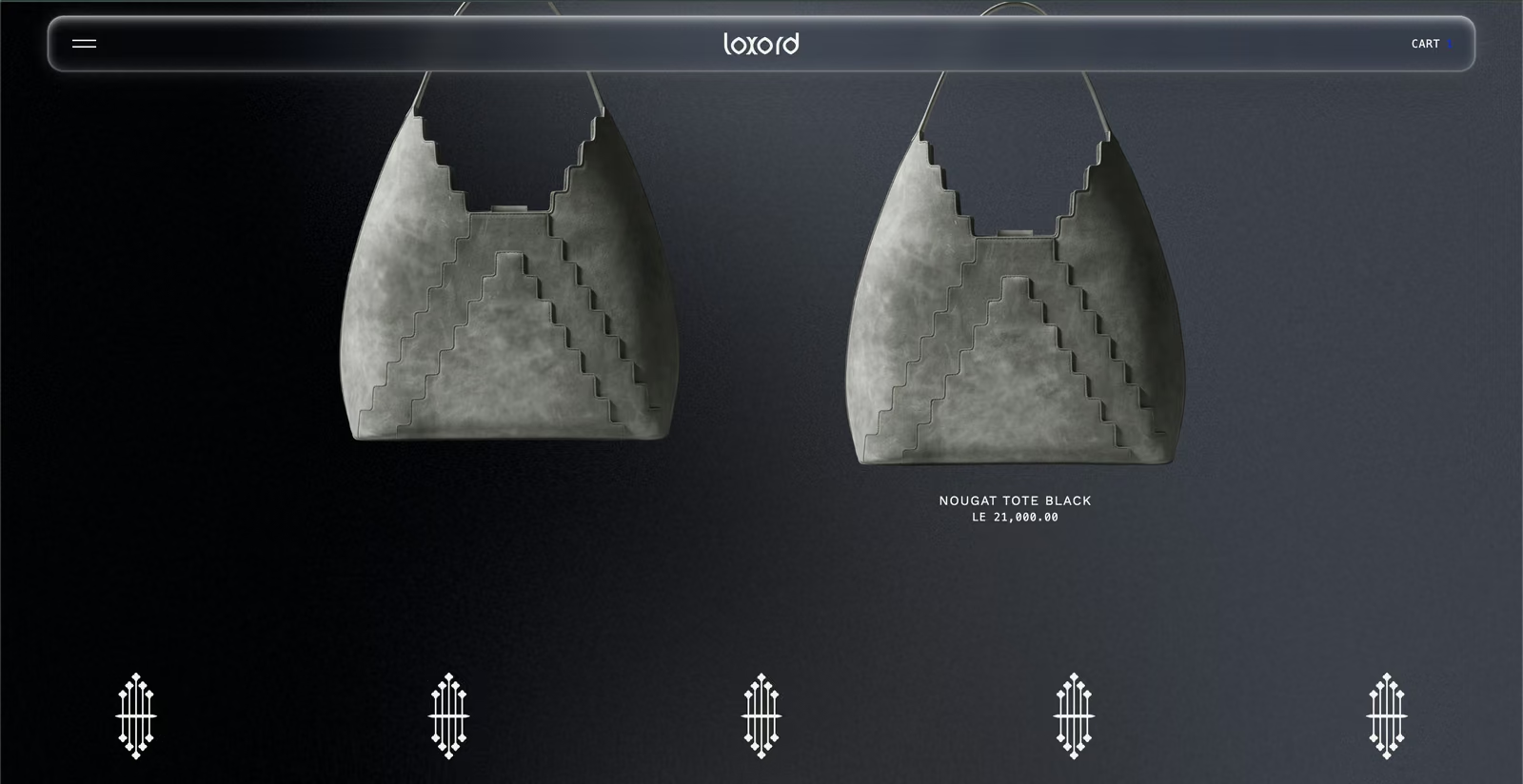
A shop that catalogues rather than sells.
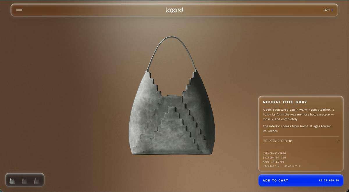
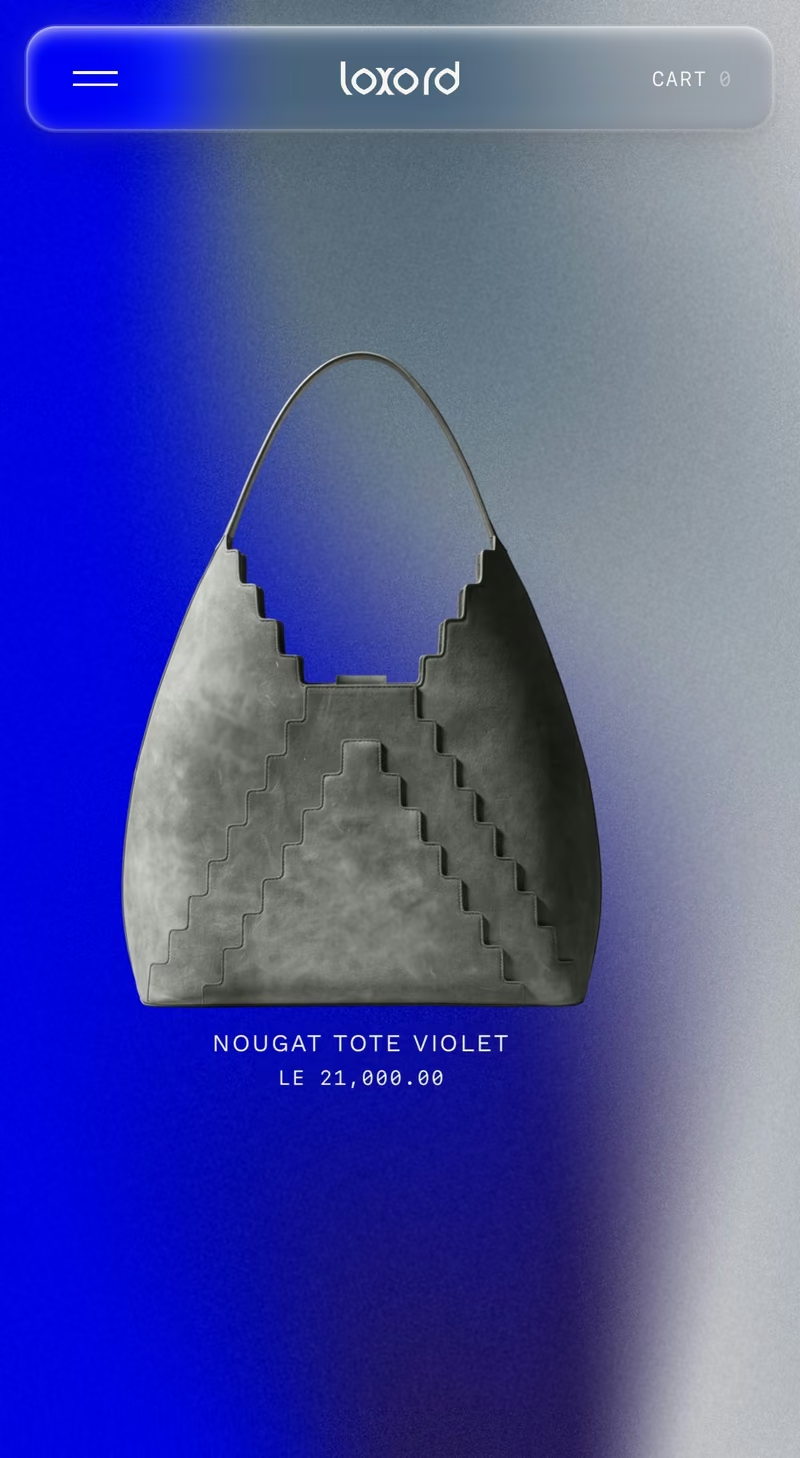
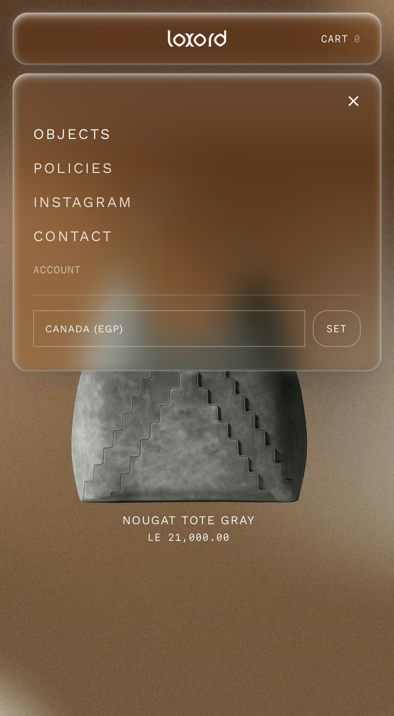
Every object carries an archive code, an edition size and the coordinates of the city it was made in. LXR-C0-02-2026. Edition of 150. Cairo, 30.0444 degrees north. That is the vocabulary of a collection rather than a storefront, and it settles everything downstream: no countdowns, no scarcity banners, no you-might-also-like. None of those belong to an object that has been catalogued. The nav says OBJECTS, not products. The grid is called a SET, not a collection.
VISIT LOXORD ↗Client
Loxord
Role
Concept, art direction, design, build
Scope
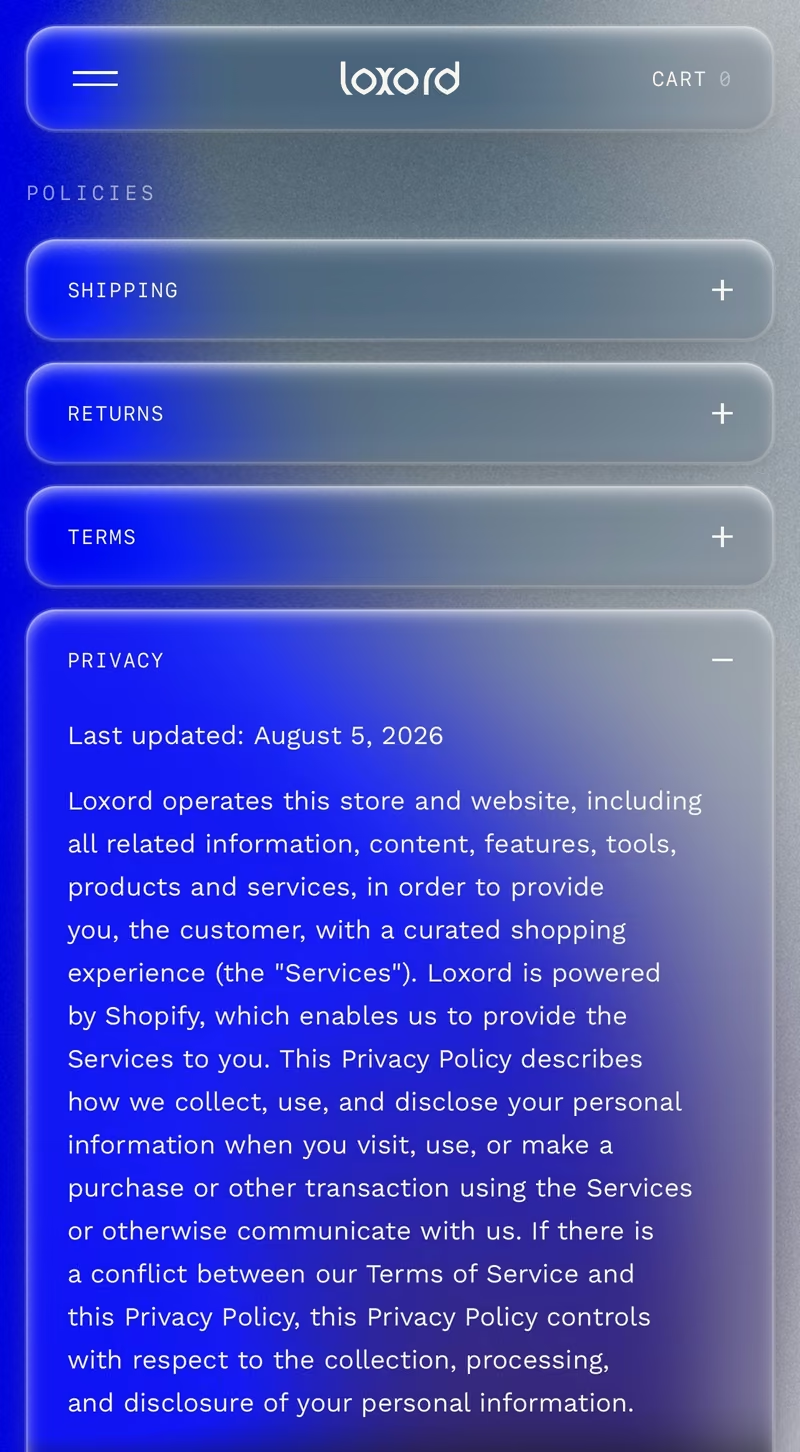
Storefront, product, policies, contact
Platform
Shopify
Live
Philosophy
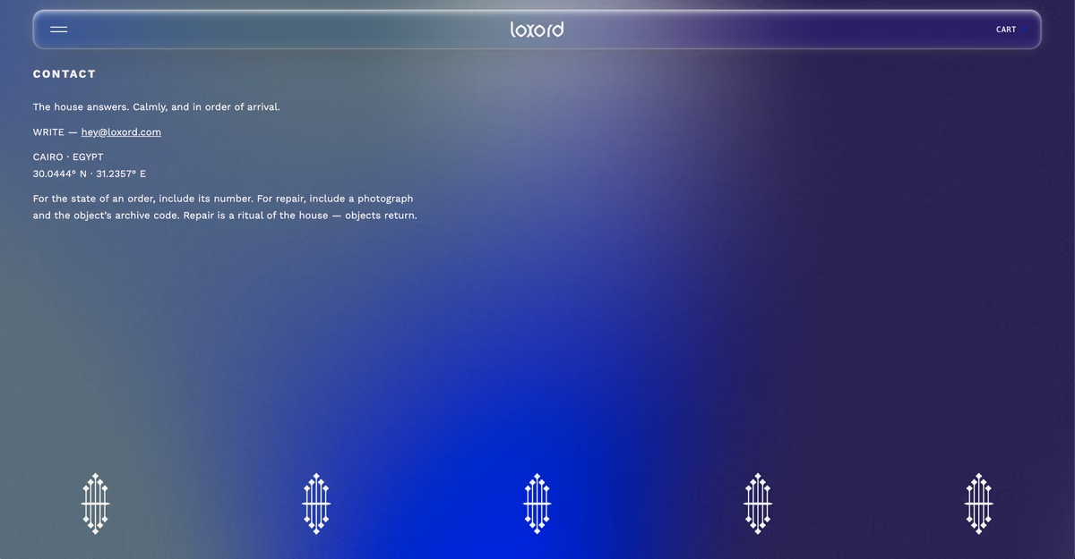
Repair is a ritual of the house. Objects return.
That line sits on the contact page and it is the whole position. A store built to move volume treats a return as failure. This one treats it as the relationship continuing, and asks for a photograph and the object's archive code the way a workshop would. The voice holds the same register everywhere. The house answers, calmly and in order of arrival. It holds its form the way memory holds a place, loosely and completely. Language doing structural work, not decoration.
Inspiration
The pyramid is not printed on it. It is its outline.
The stepped profile of the tote is a ziggurat seen side on — the same Saqqara reference that runs through the physical work, but structural rather than applied. Bag and store were drawn from one set of references, and the store carries it through: each page sits in its own colour field rather than a shared white, so moving between object, product and contact feels like moving through rooms instead of tabs.
CAIRO929
Statement
Three languages, one of which runs the other way.
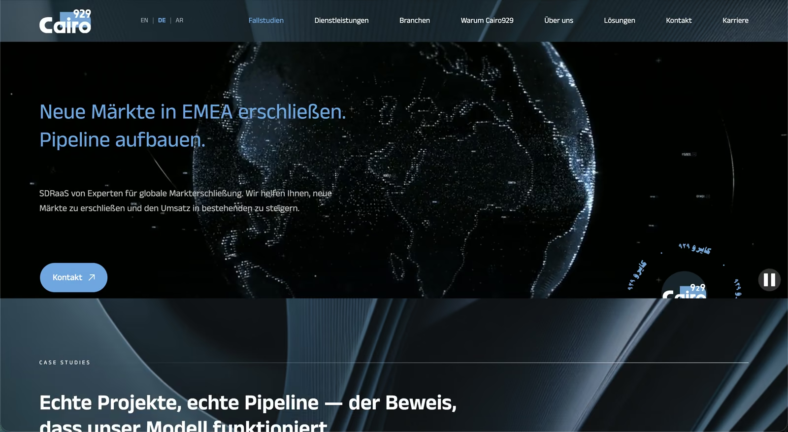
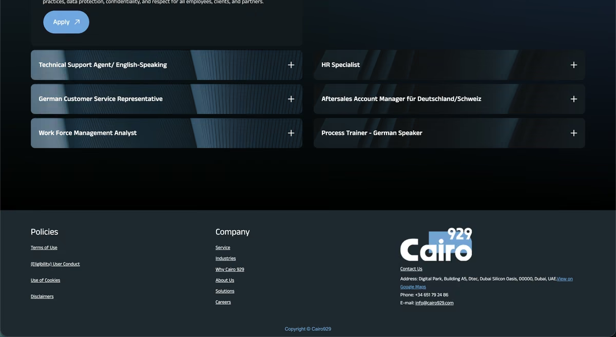
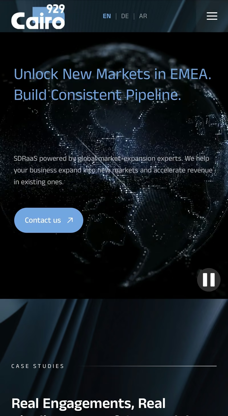
Cairo929 sells outbound sales into DACH, the UK and the Gulf — which meant the site had to hold in English, German and Arabic. That is three different problems wearing one layout. German compounds run long and break grids measured in English: Aftersales Account Manager für Deutschland und Schweiz has to sit in the same card as a four word English title. Arabic runs right to left, which is not a translation job but a structural one — reading order, navigation, the direction arrows point, where a number sits relative to its label. A layout that only survives in one language is not a layout. It is a picture of one.
VISIT CAIRO929 ↗Client
Cairo929
Role
Brand, concept, design, build, copy
Scope
Trilingual site — EN / DE / AR
Platform
Webflow
Live
Philosophy
Proof first. Promise second.
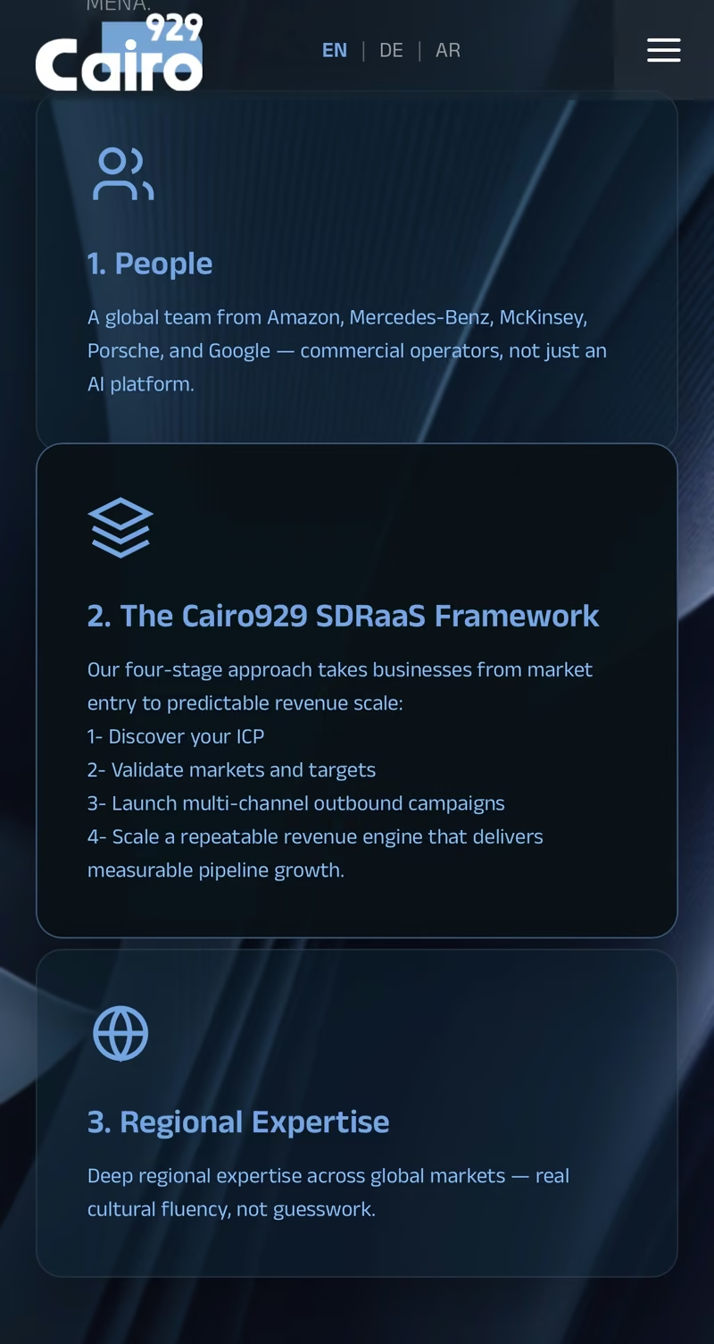
Every agency in this category opens with the same sentence about predictable pipeline, so the claim itself is worthless as a differentiator. The site leads with evidence instead: two million in expansion revenue, three months to a first signed customer, four Gulf markets entered after two previous attempts had failed. Numbers before adjectives. The structure follows that order deliberately — case studies sit above services in the navigation, because what was done is more persuasive than what is offered.
Inspiration
Reading is a direction before it is a language.
Arabic typesetting was the reference, not other agency sites. Once a layout has to mirror, every asymmetry becomes a decision you have to defend: which side the logo sits, which way progress runs, whether an arrow means forward or back. Building the English version so the Arabic could exist made the English version better — the same discipline that makes a grid work at two breakpoints instead of one.
select work
✕